New Paltz Astronomer is a theoretical app created for the John R. Kirk Planetarium at SUNY New Paltz. Users would be able to book tickets for planetarium shows, mark these events on a personal calendar, and view the night sky with AR. I took on the role of Project Manager for this project.
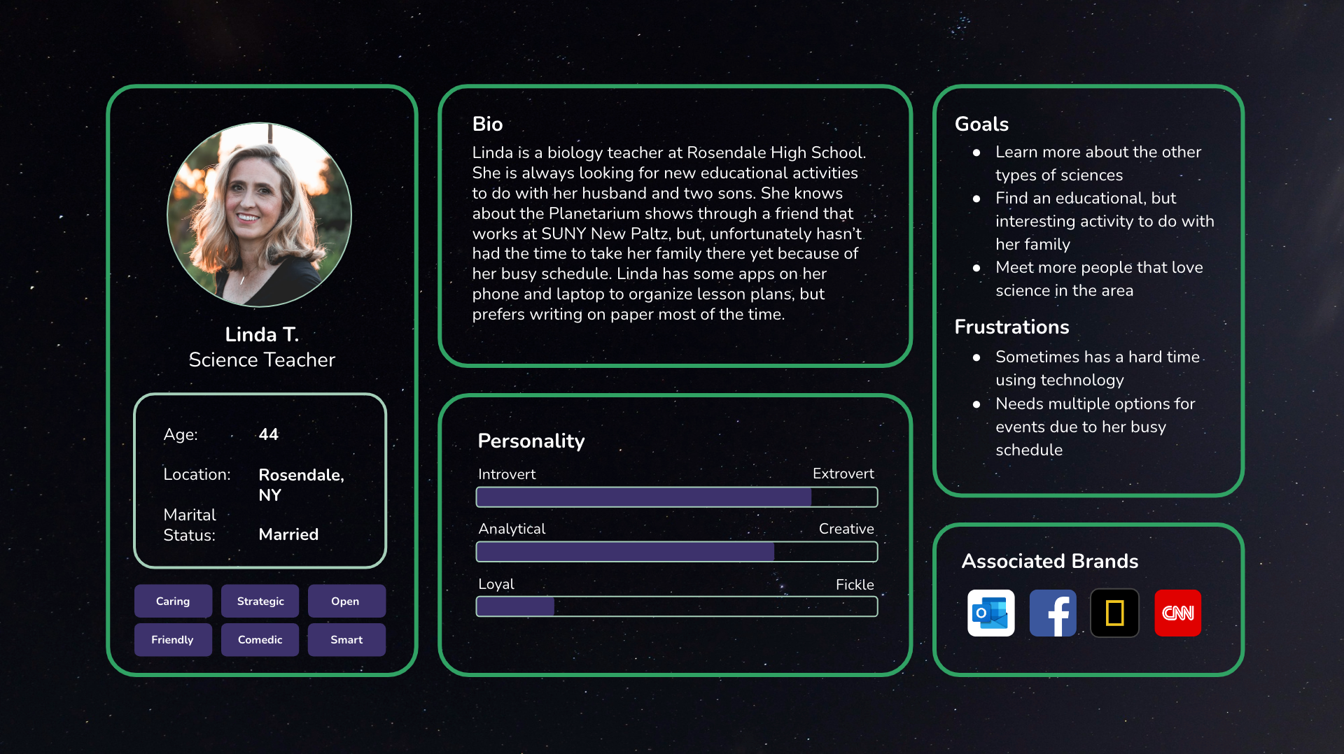
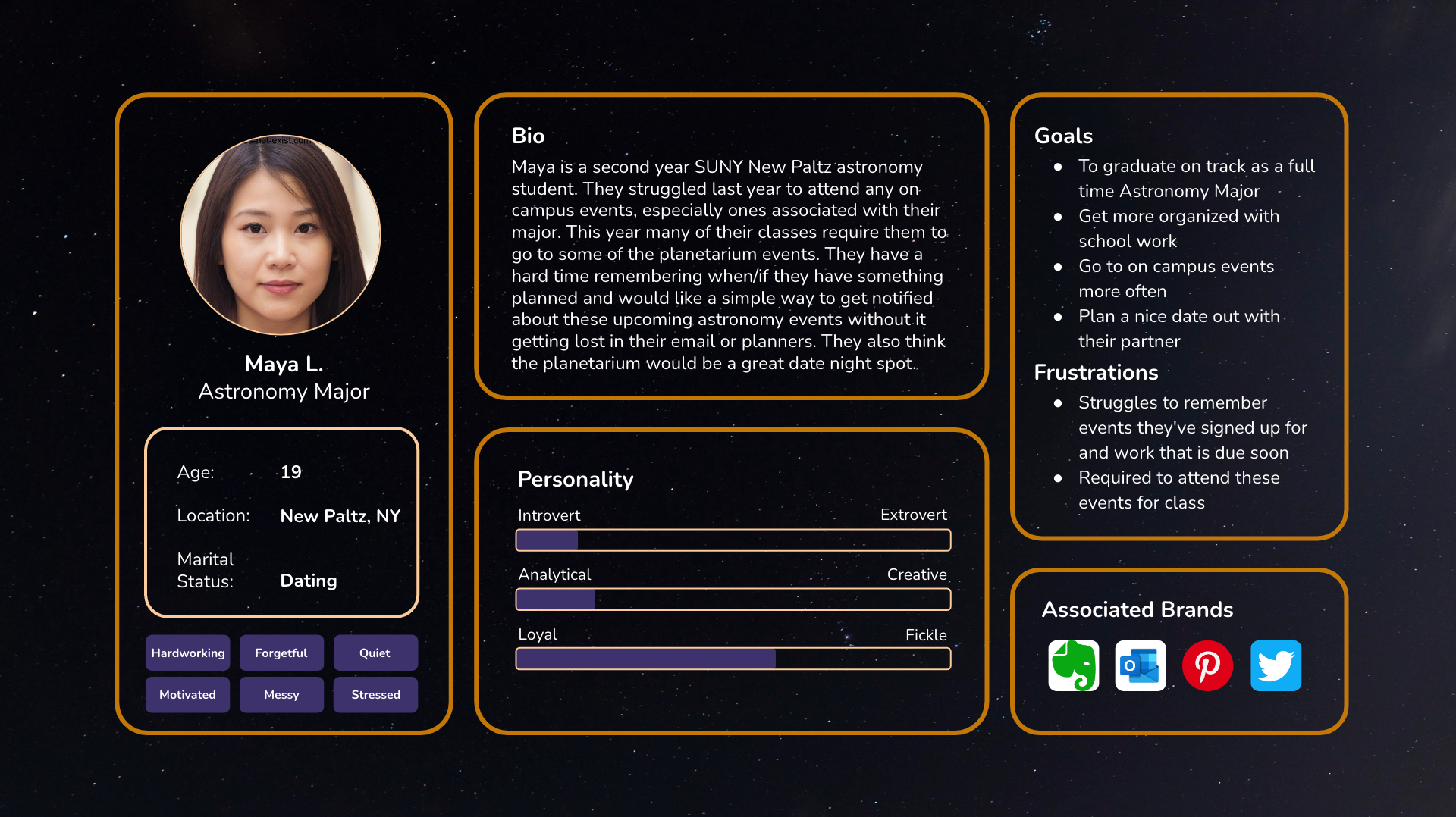
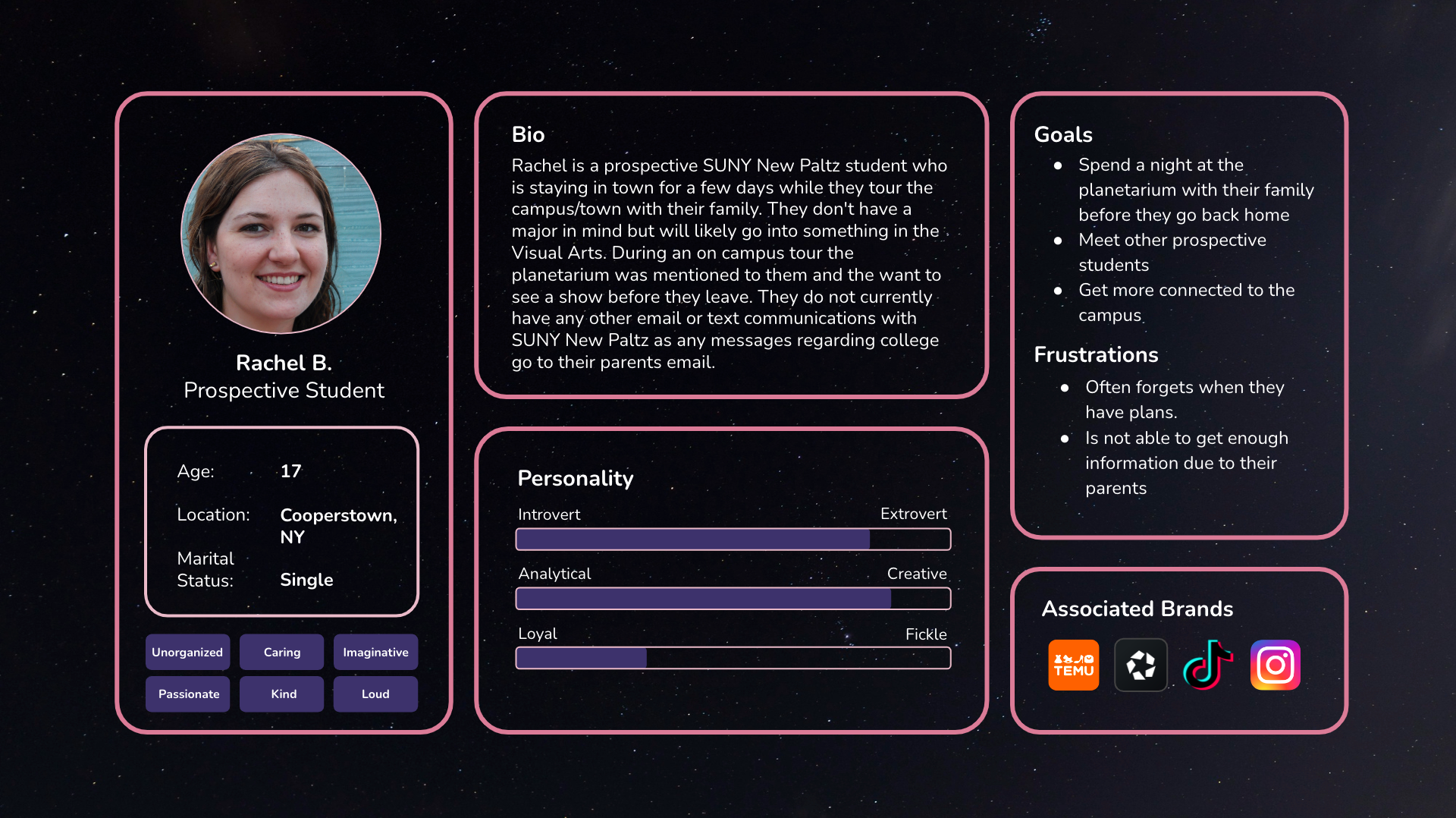
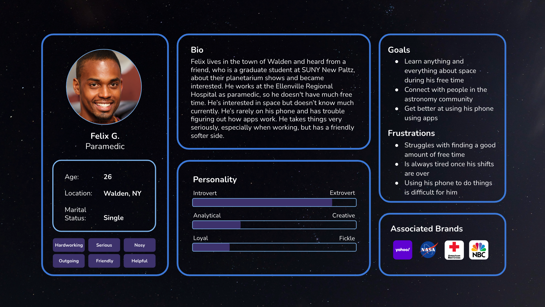
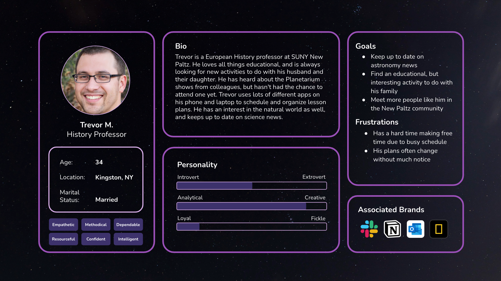
Each member of the group created their own persona
Personas
These are a few people that could find this app useful. New Paltz students and staff would benefit, as the planetarium is on the college campus, and residents from around the New Paltz area could learn more about stargazing. They show us the important features to focus on in the app, like the calendar, and a simple, mistake-proof way to book tickets.
Content Mapping
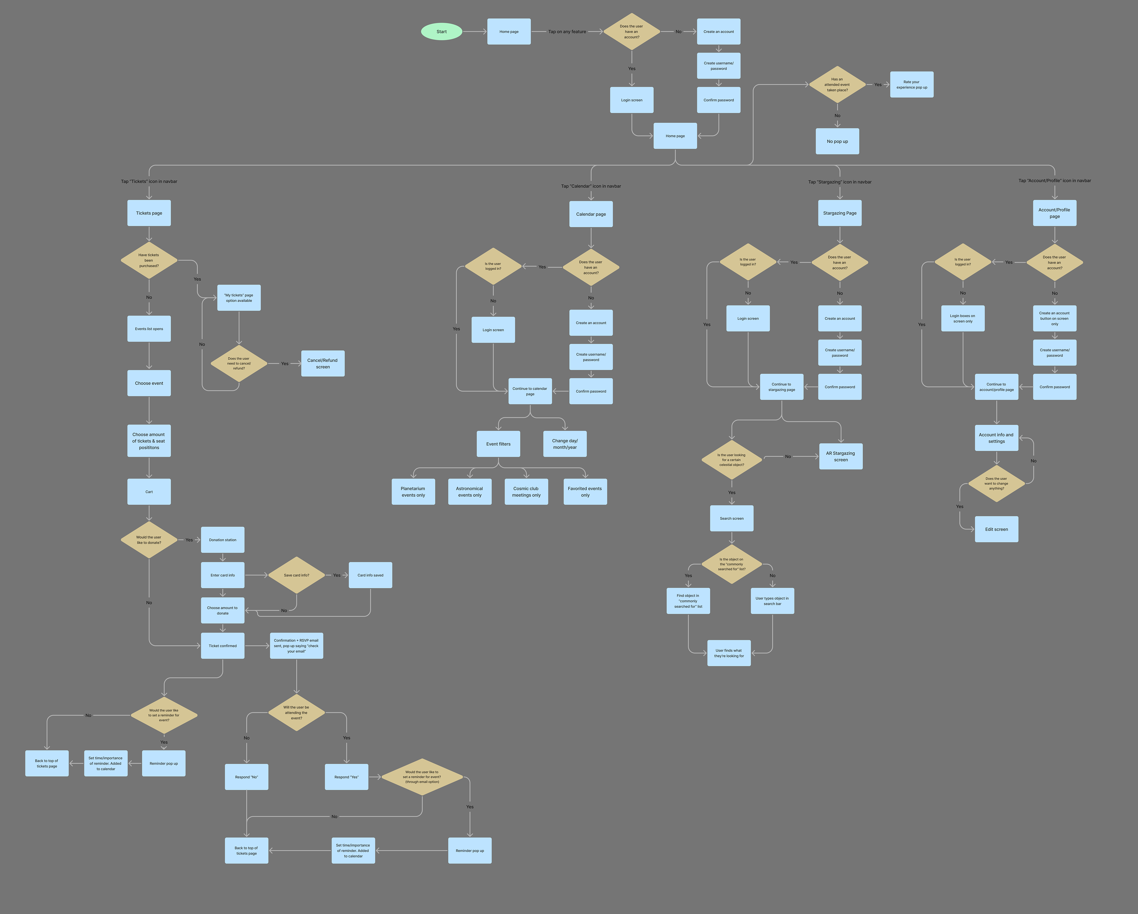
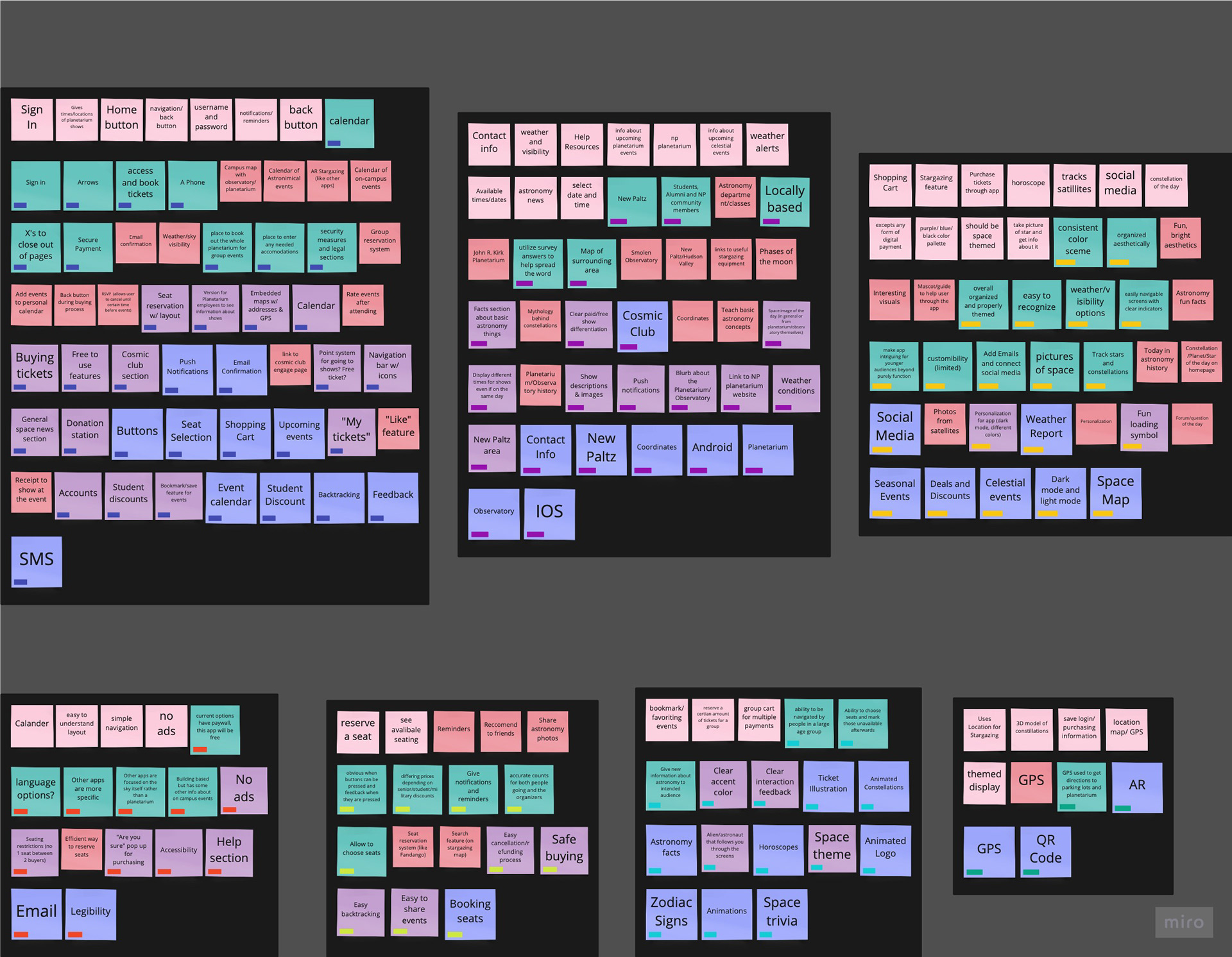
These documents were used to plan out what features would be included in the app, and how the app would be divided into sections. Here is where the navigation bar is created, and what features belong in each category of the app. These charts were helpful in figuring out how many pages needed to be created, and how to make the app flow easily.
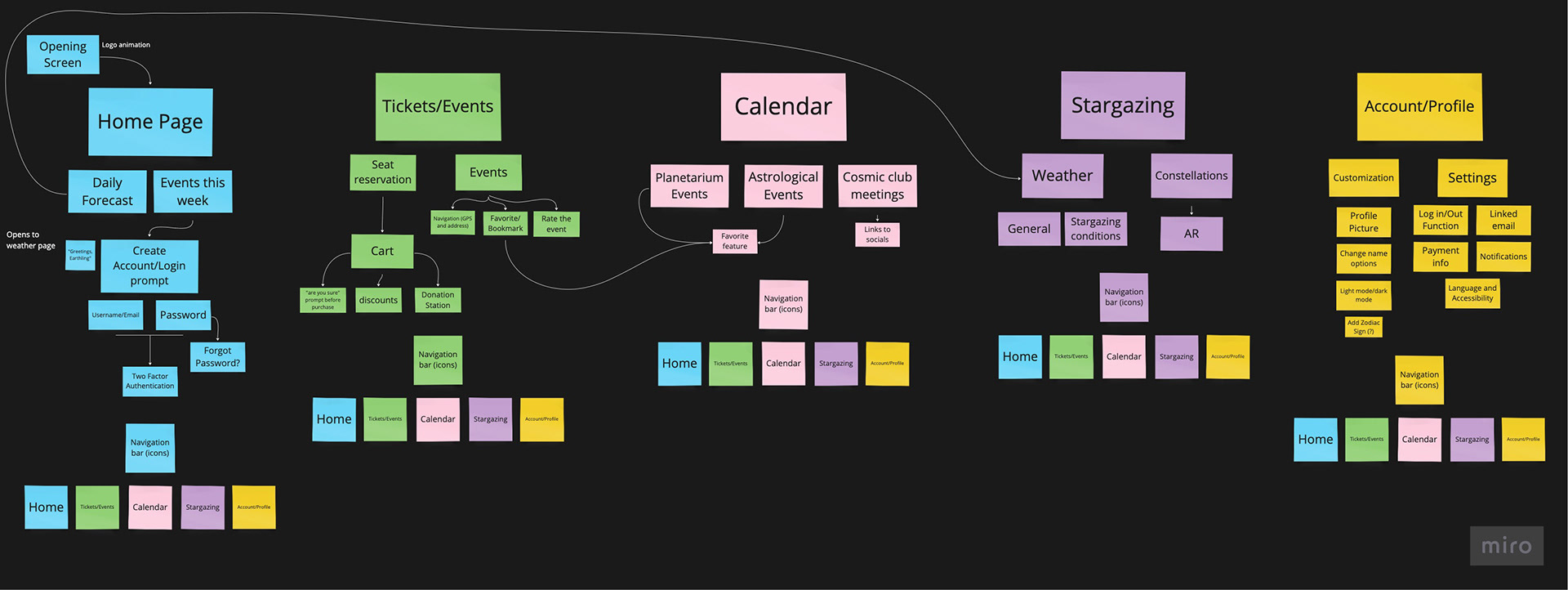
At this stage, the content of the app was determined, and the navigation bar was created.
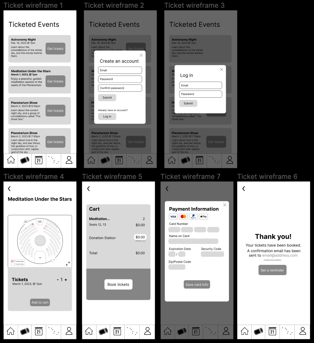
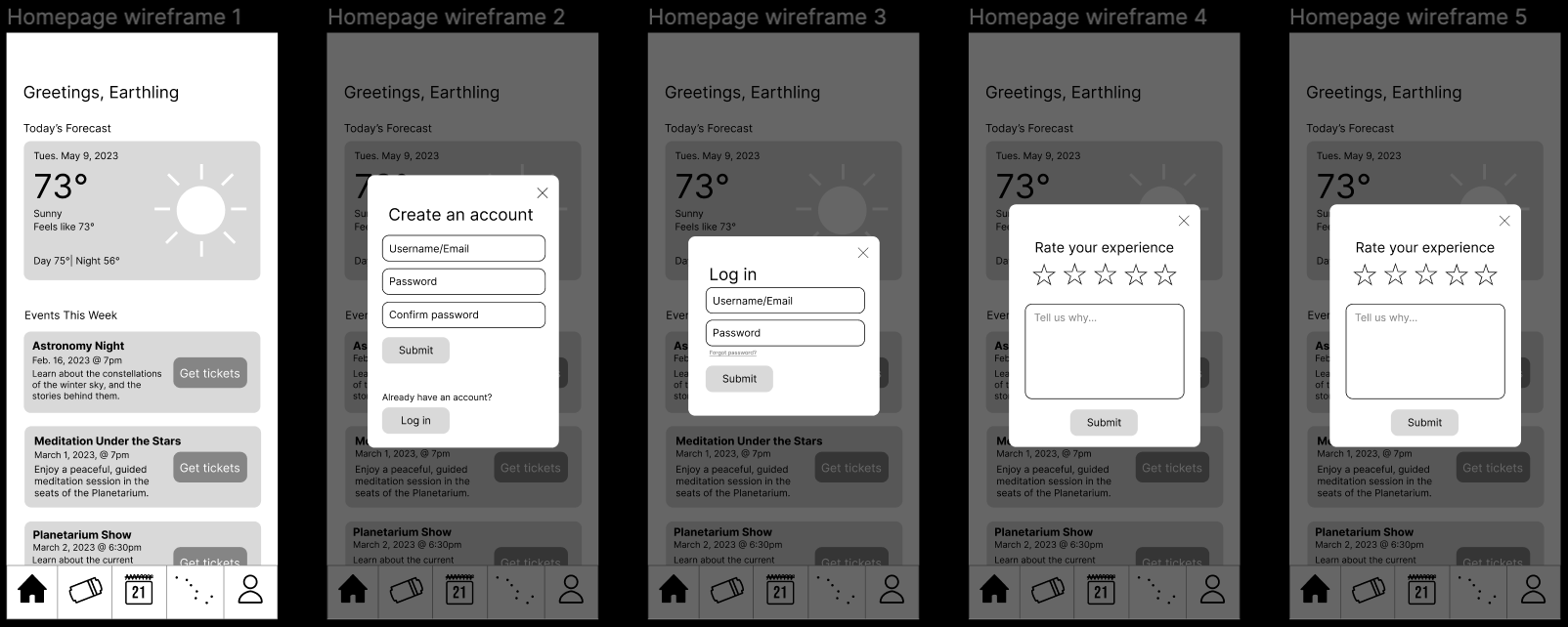
Wireframes
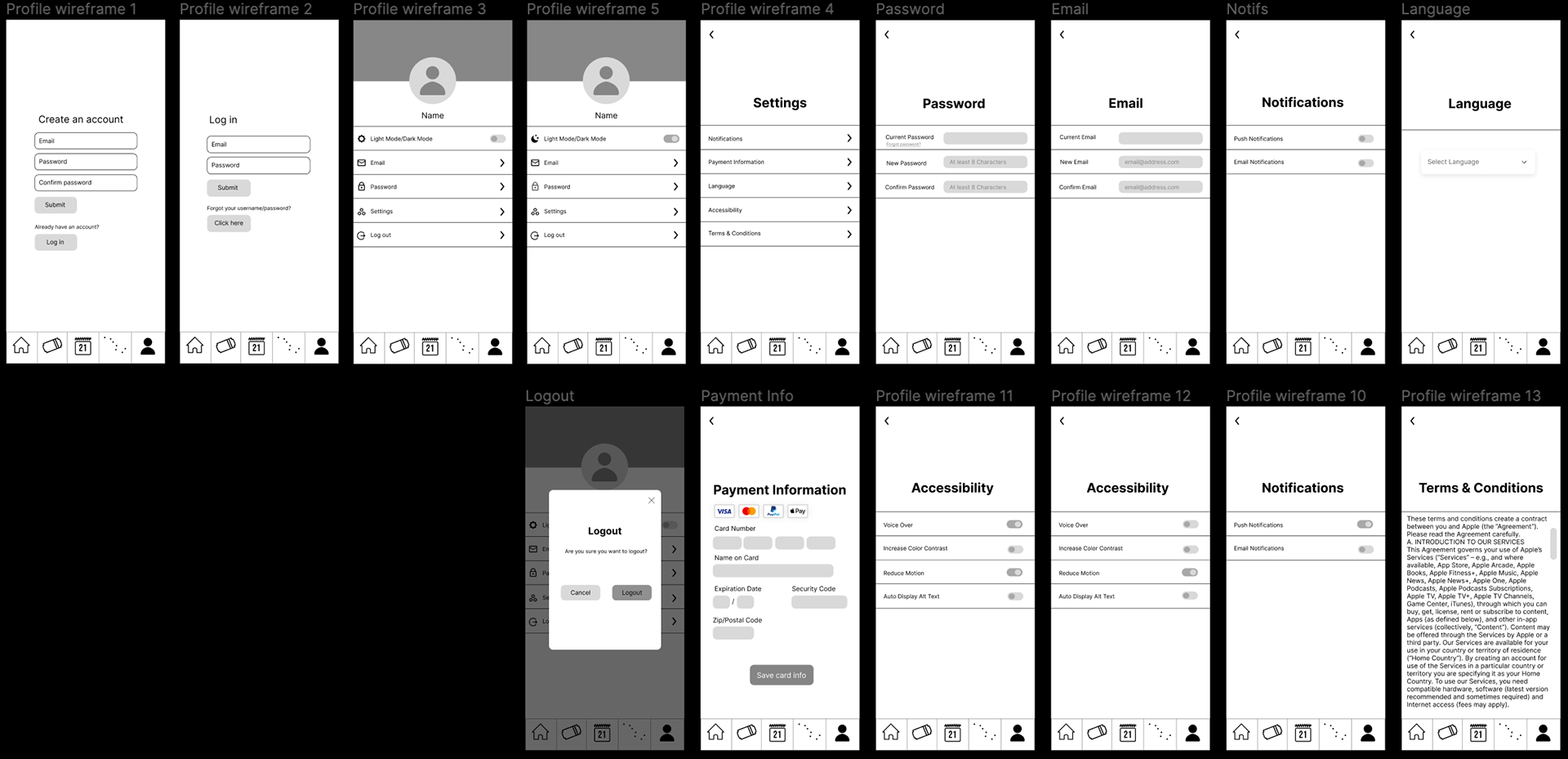
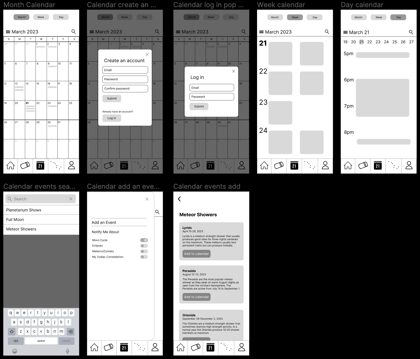
Here is where we began to visualize how the app would actually look. Especially for the tickets pages, it was important to have all of the important information on a single page, but in a way that they were easy to read and organize. Most of these elements made it into the final app, but their visual hierarchy was rearranged to focus on the features that make the app unique from other apps like it.
UI Designs
Each member of the group then created their own UI design, and app icon, using four representative screens of the app. Each design shared some similar elements, like a display font reminiscent of science-fiction movies, and a cool color palette. The final UI design takes elements from each design, and as a result, a cohesive aesthetic was established.

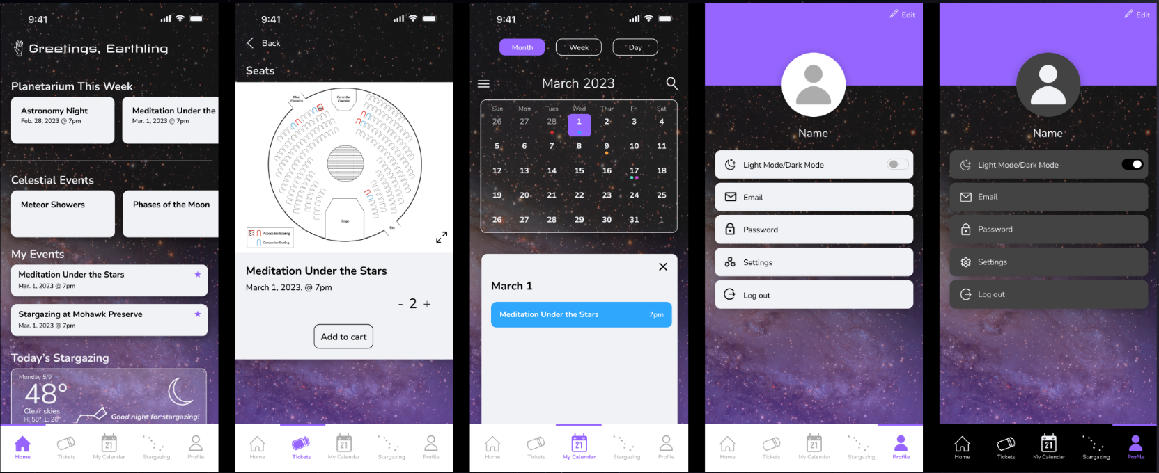
Each group member was tasked to design an app icon and a corresponding visual language for four important screens.
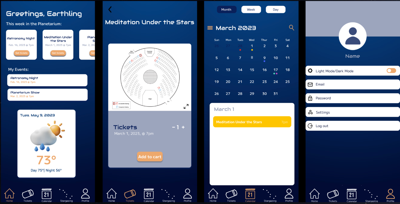
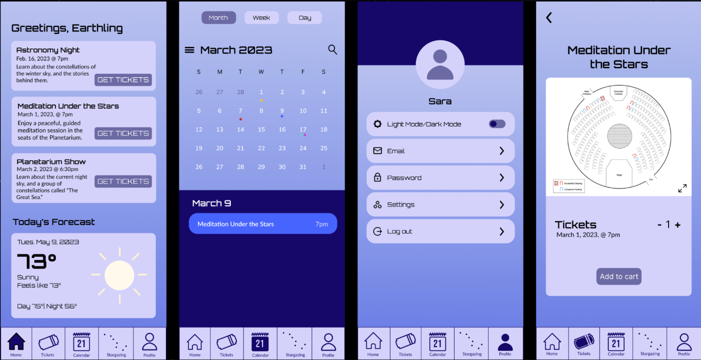
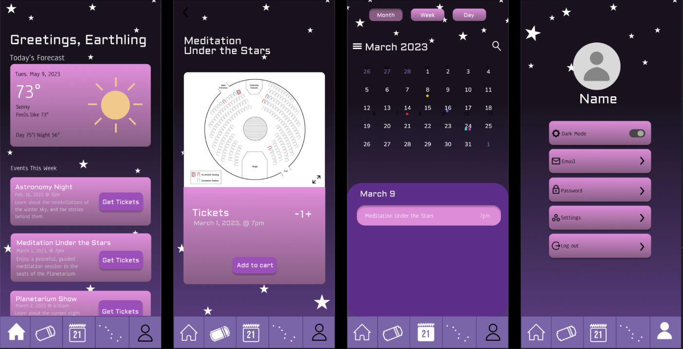
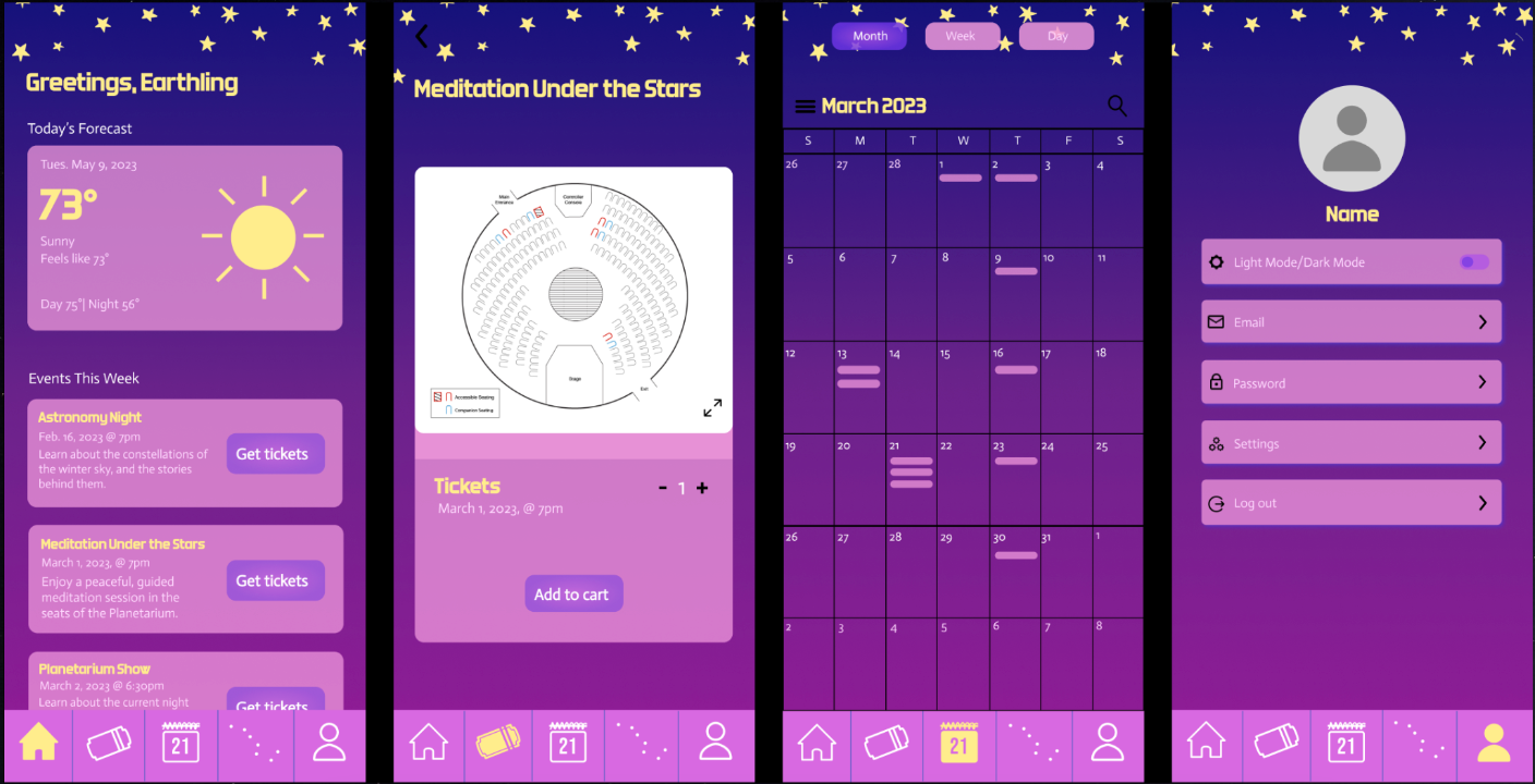
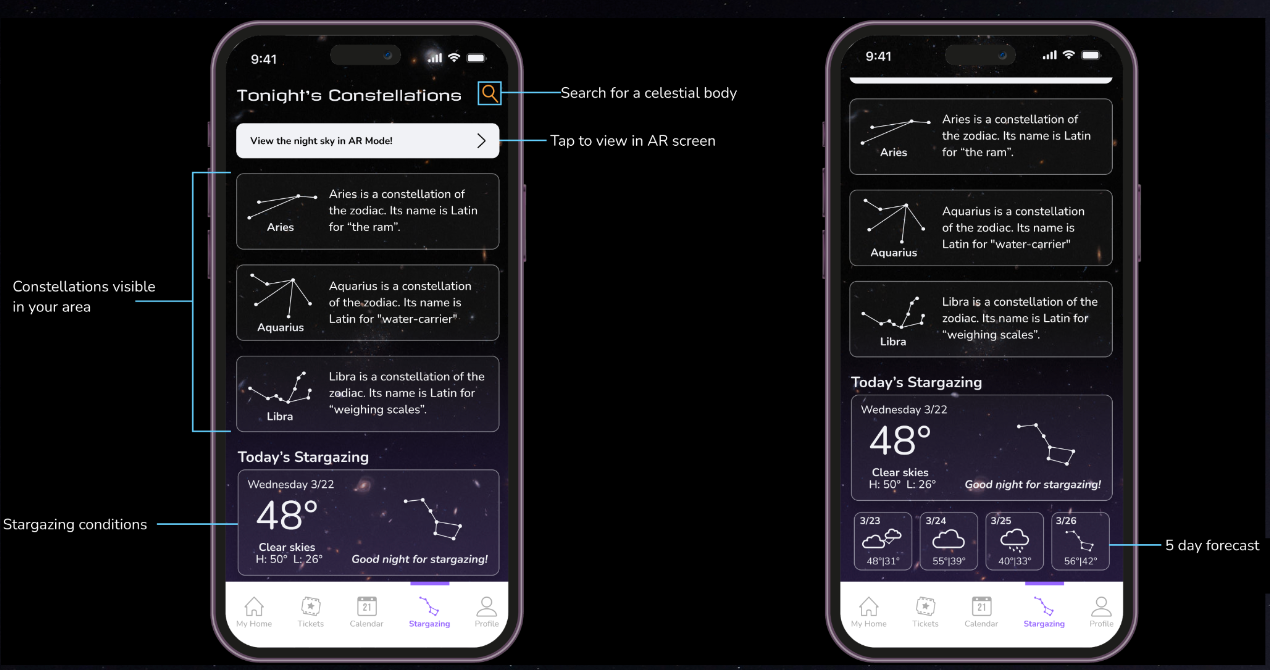
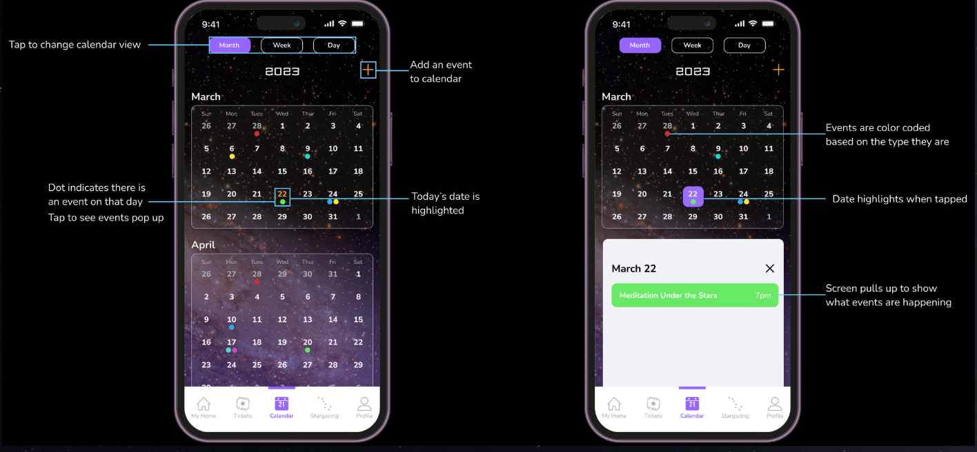
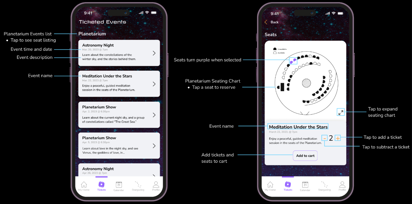
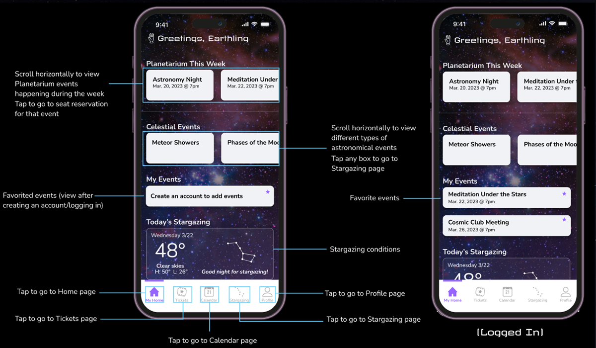
Final UI Design
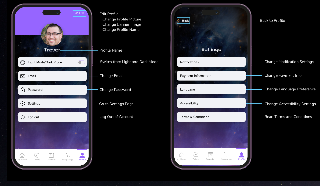
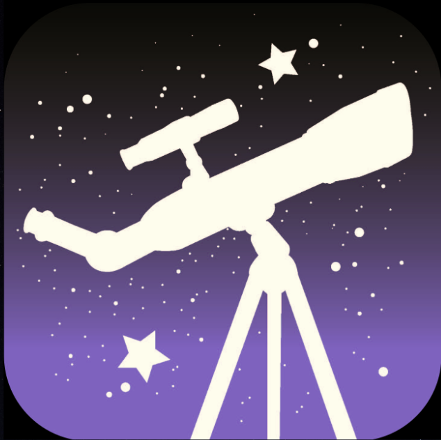
The final UI design helps the app have a more scientific feel by using background images taken by NASA, and the accent orange was needed to break up all of the purple. The most notable change since the wireframing phase is the calendar. We replaced the too-small boxes with clickable numbers, and a pop-up that shows the user what events they have on a given day. To match the app, we chose this icon with the telescope. It's a recognizable shape, and encompasses the ideas of looking at the stars both in the planetarium and outside.
This was my first time taking on a leadership position for a design project. While the challenges involved with managing people were tedious, I was confident that my effort would contribute to the betterment of the project. I'm glad my skills and those of my teammates combined to make a final product that we can be proud of.
