This poster is the culmination of a research project about how SUNY New Paltz students cope with stress. The goal of this project was to investigate a topic of our choosing using two different methods of research. I then created infographics to showcase my findings.
Topic
The topic I chose to explore for this project was the stress levels in college students, and how they manage their stress. I thought this would be a suitable topic, since my audience was so accessible and I was a part of it. College is an extremely stressful time, between heavy workloads, maintaining social relationships, and preparing for the future. Many students do not have healthy coping mechanisms, so seeing how other students deal with stress could inspire them to adopt new coping strategies.
This article from the American Psychological Association helped guide my research, and provides creative methods college campuses have used to manage students' stress.
Each student had their own idea of what the campus could do to help students cope with stress.
Research Method 1: Survey
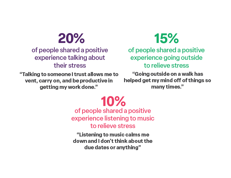
The first research method I utilized was a survey created in Google Forms. This was a quick and easy way to collect the same type of data from different people in a short amount of time. The survey indicated that schoolwork seems to be the main cause of stress in college students, and many of them desire more on-campus mental health resources. The most popular stress management methods among respondents were listening to music, going outside, and talking to someone they trust.
Research Method 2: Self-Observation
The second method used to collect data was a self-observation. Journaling is an effective way to deal with stress, and I wanted to see how it could help students. So, I had five different students of different majors log everything they did for three days, and rank how stressful each activity they did was on a scale of 1 to 10 (1 being not stressful at all, and 10 being extremely stressful). I designed this chart for participants to track their daily activities. Each student had high and low values, most of the higher rankings coming from doing schoolwork or scheduling.
Each participant received a packet with three of these pages (front and back), one for each day of observation. The last page gave participants space to reflect on the experience.
Visualizing the Research
After collecting all of this data, it was time to visualize them. My goal was to use a different type of chart for each question, and this was achieved by giving each question in the survey a different answer method. Some questions were multiple choice, others asked for written answers. I chose a color palette with bright, distinct colors to parts of the infographics did not look too similar. (Hover over each infographic to see the question associated with it).
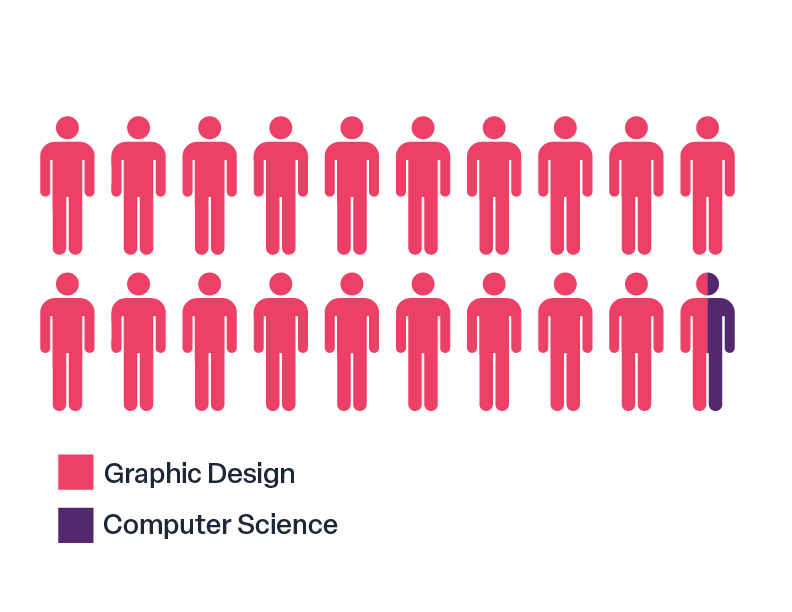
Q1: What is your major?
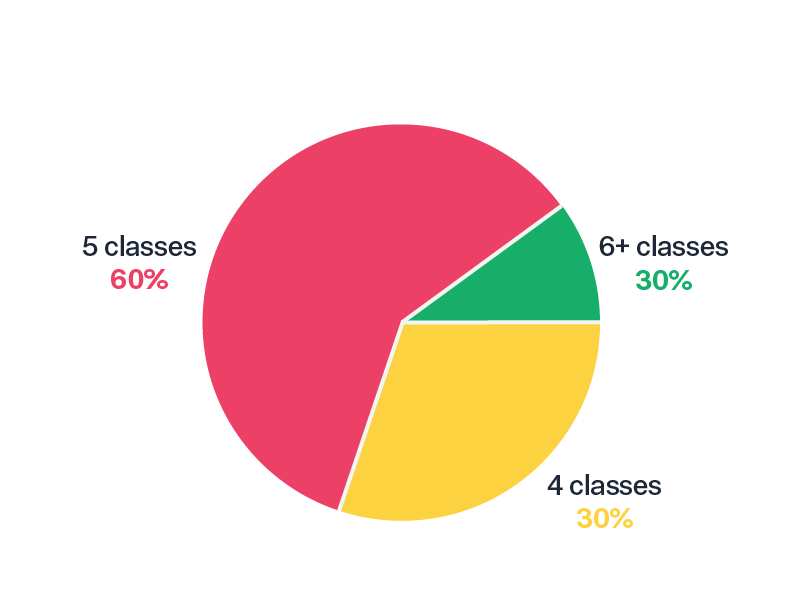
Q2: How many classes are you taking this semester?
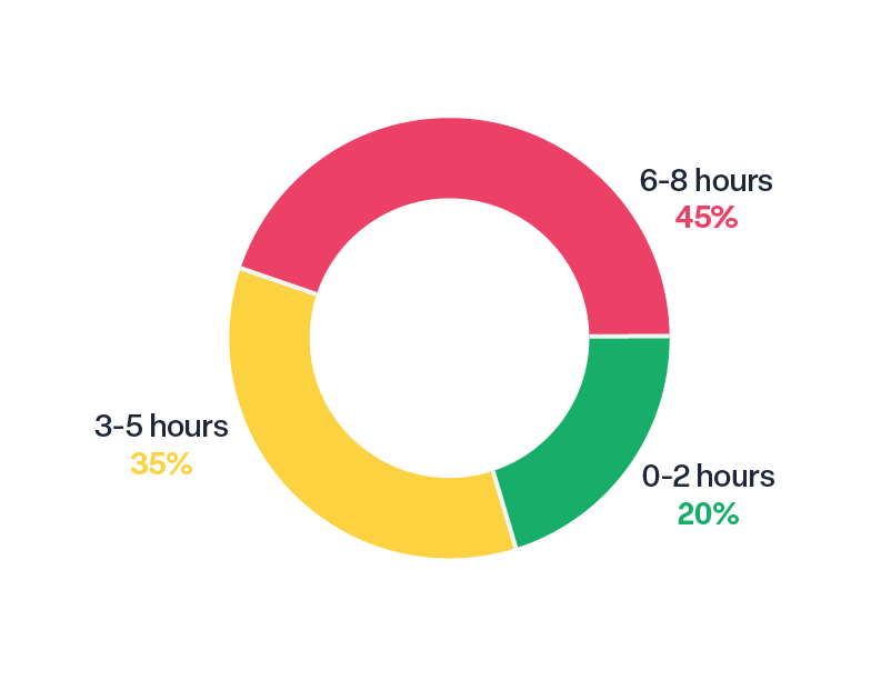
Q3: On a typical day, how many hours do you spend on schoolwork?
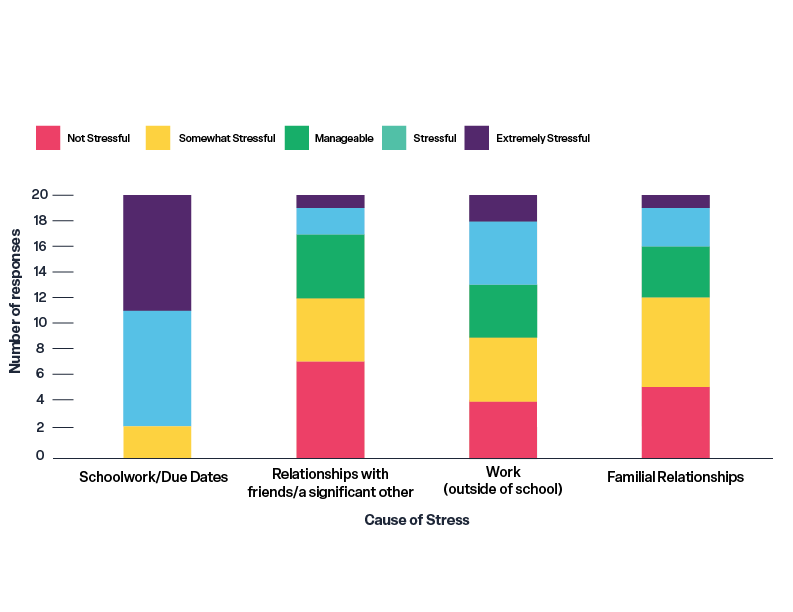
Q4: How would you rate your stress in each of these areas?
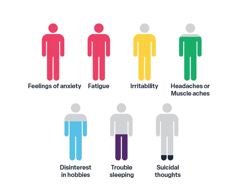
Q5: Which of these common symptoms of stress have you experienced before?
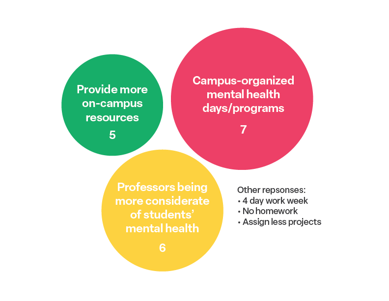
Q6: What is something you think SUNY New Paltz could do to help students with their stress?
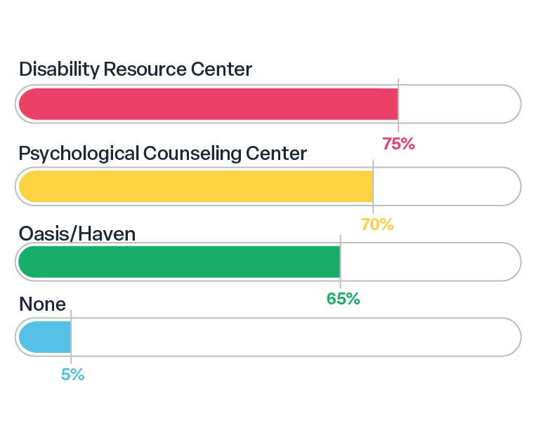
Q7: Indicate which of these on-campus mental health resources you’ve heard of:
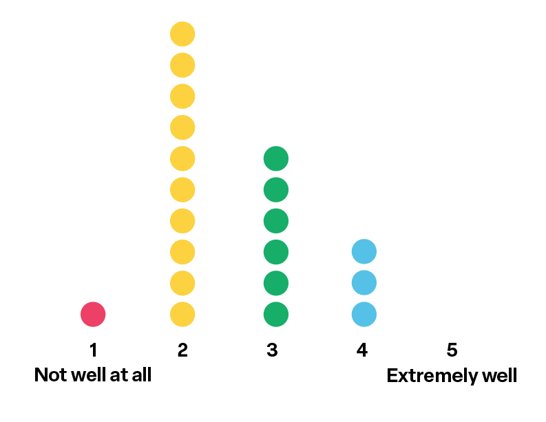
Q8: How well do you think you manage your stress?
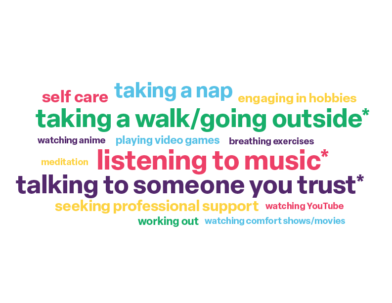
Q9: Indicate which of these stress-relieving activities you have tried before:
