This is a tourism microsite for Phillip Island in Victoria, Australia. The island's most popular attractions are its natural features and unique wildlife populations. Using bright colors and a family-friendly approach, I created an enriching natural experience for all ages.
Personas
The first persona I created was Sydney, a college student with a passion for photography. Her goal is to become a wildlife photographer, and Phillip Island is the perfect destination. A user like Sydney would need this site to plan her trip, and discover what kind of life she can photograph at tourist attractions like the Phillip Island Wildlife Park.
The second persona I created was Isaac and Carter, a father and son who love to explore the outdoors together. Phillip Island would be a great place for the two of them to visit, as there are many activities that would keep both adults and children engaged. For Isaac and Carter, this site would have to be accessible on desktop and mobile, for viewing and planning on-the-go
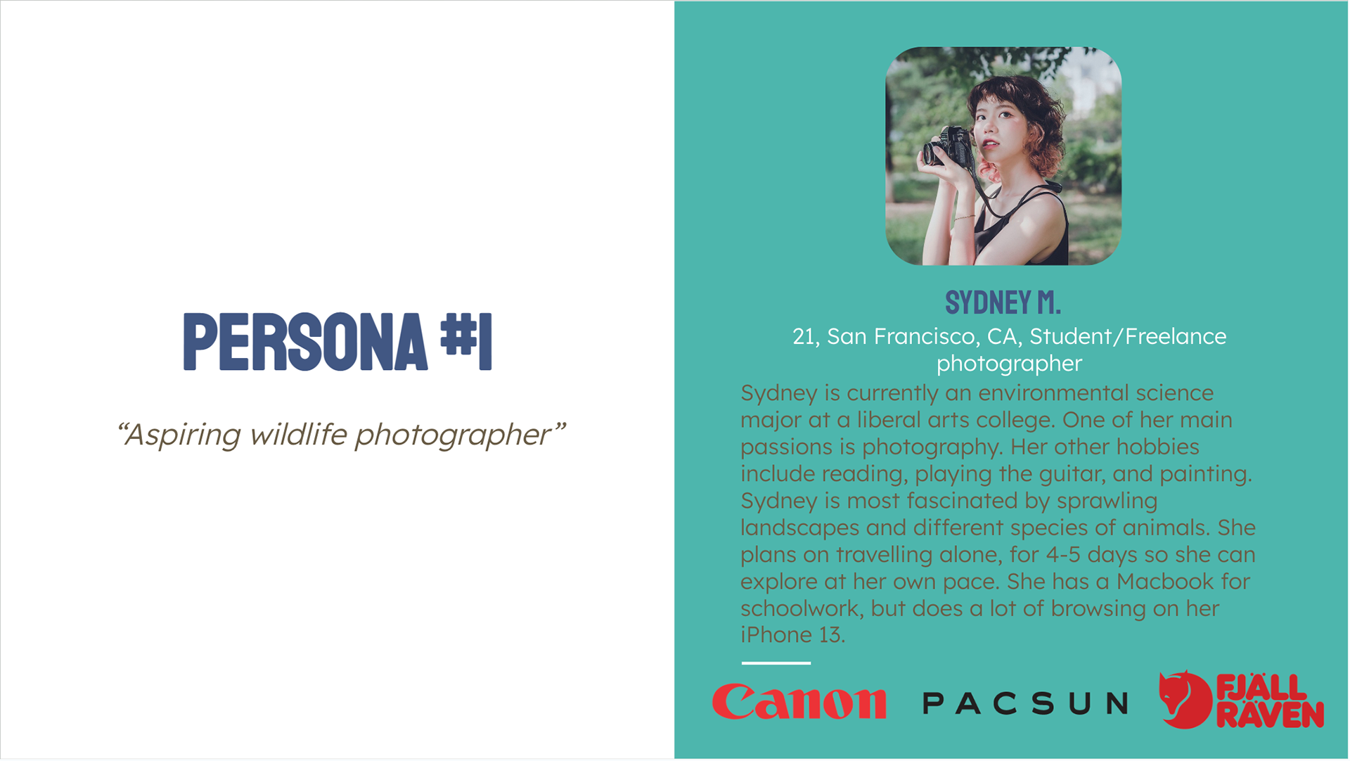
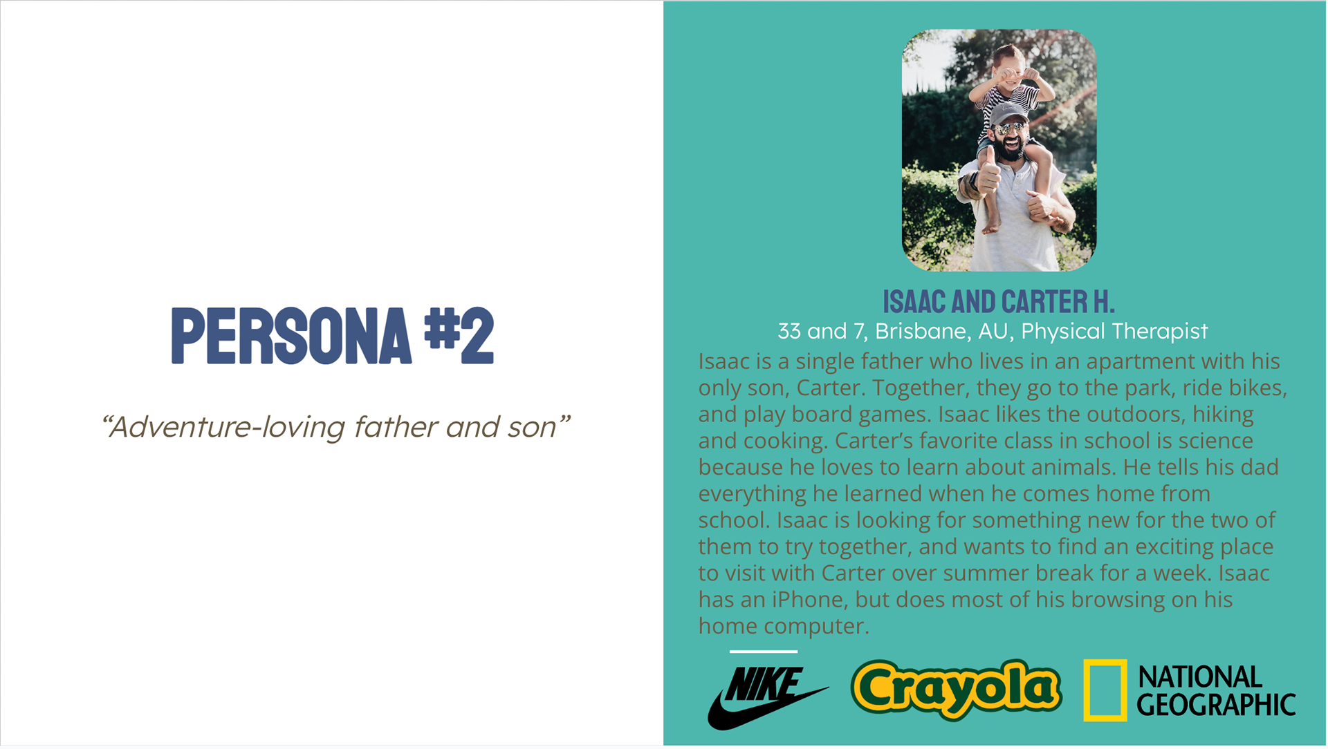
These personas were created to consider what kind of visual language and imagery the website should have.
Moodboards
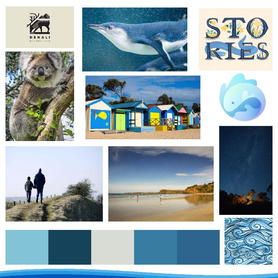
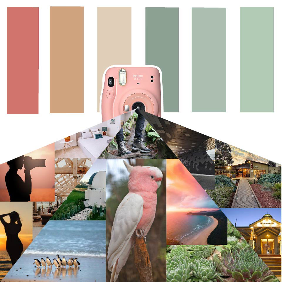
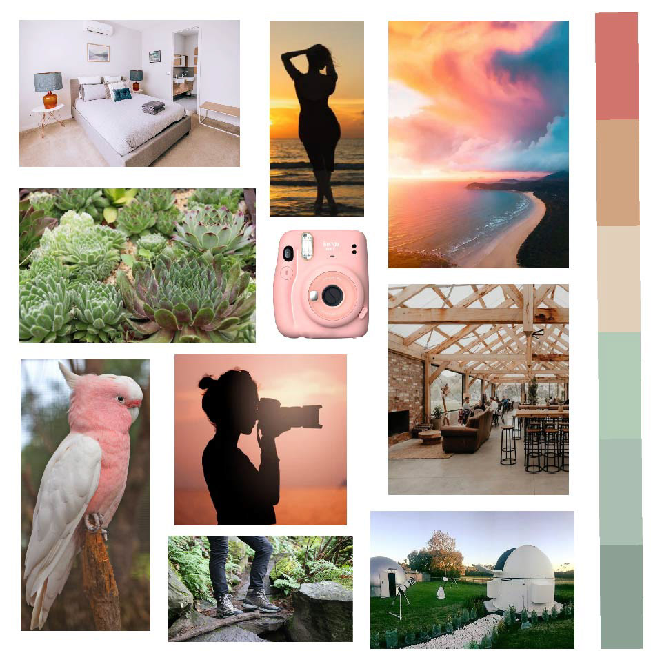
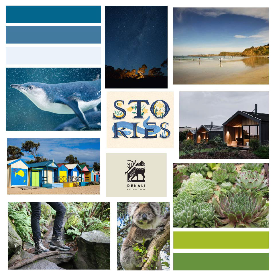
With these personas in mind, I created moodboards. Sydney's moodboards use more muted, earthy colors, and focus on and individual experiences, and how she would spend most of her trip taking pictures. Isaac and Carter's have brighter, more attention-grabbing colors, and imagery and activities that a parent and child can enjoy together. For the last moodboard, I combined aspects I liked from Sydney and Isaac and Carter's moodboards, to create the vibe of an experience that all people could enjoy on Phillip Island.
Site Map
After considering the personas and their needs, I began to divide the site into pages. Since this isn't a very well-known location, an 'About' page seemed like a good place to start. This would include a map and a short description to give the user a sense of what Phillip Island is like. The 'Natural Attractions' page would have resources like embedded YouTube videos and a stargazing calendar to highlight the different natural features of the island.
Site mapping was helpful in deciding how many pages the website would be, and what content would be included on each one.
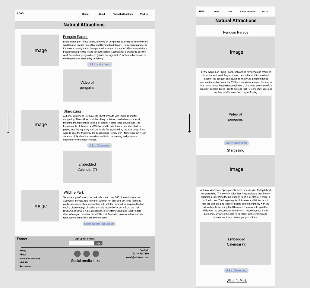
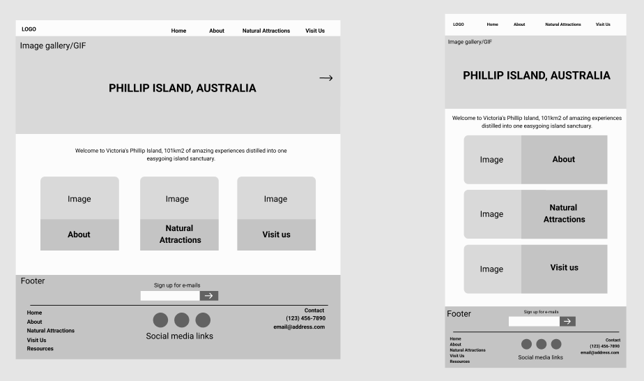
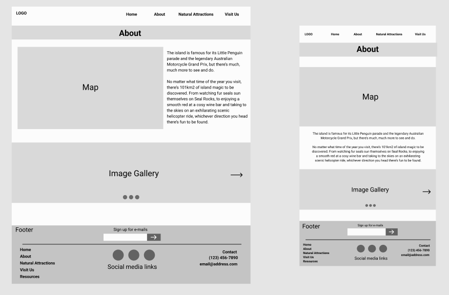
Lots of the elements that were next to each other on the desktop layout had to be stacked in the mobile layout.
Wireframes
Then it was time to start figuring out how the site would look on desktop and mobile. I realized later in the process that these mobile wireframes are not the size of a phone, but it didn't end up being too serious of a problem. I initially wanted many features that were on the desktop to look the same on mobile, but they would most likely look too small. Certain aspects like the hero image on the home page, and the navigation bar were not as usable on mobile as they are on a desktop.
Style Tiles
For the first style tile, I was inspired by aquariums. So, I chose a bold, sans-serif font for headers and titles, and a condensed font for sub-headers and body text. I chose a cold, blue color palette to reflect the water surrounding the island. For the second style tile, I chose a more fun-looking and welcoming font for headers, and an easy-to-read sans-serif for the subheadings and body text. The final style tile combines elements from the first two iterations. It keeps the mostly blue color palette that I liked, but less cold. I also added a bright orange as an accent, as it complemented many of the images I planned to use for the site.
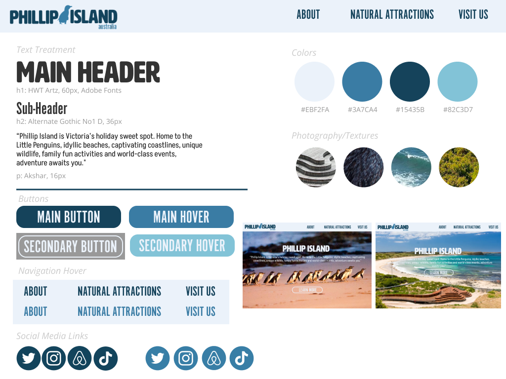
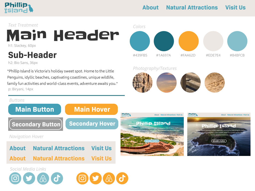
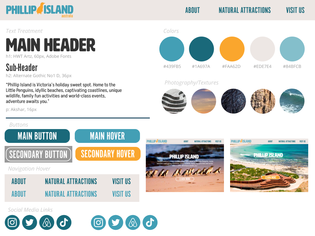
This final moodboard combines the elements I liked from the first two, like the header font, and the bright orange accents.


After lots of iterations, this version had a perfect balance of blue and orange that reflected the website.
Logo Ideation
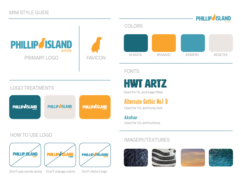
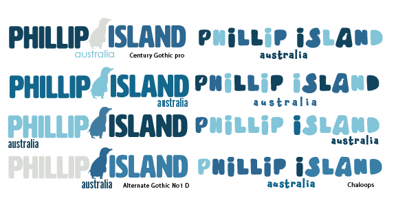
The next step was to finalize the logo. There were many factors I considered, like the placement of the word "Australia", and which colors would go where. I tried some different fonts, but the penguin inside the "P" did not translate well on a small scale. Instead, I filled the space between the words with the penguin to give it more emphasis. I eventually came to the iteration with the name of the location in a shade of blue that would be present throughout most of the site, then orange as the accent.
Prototyping
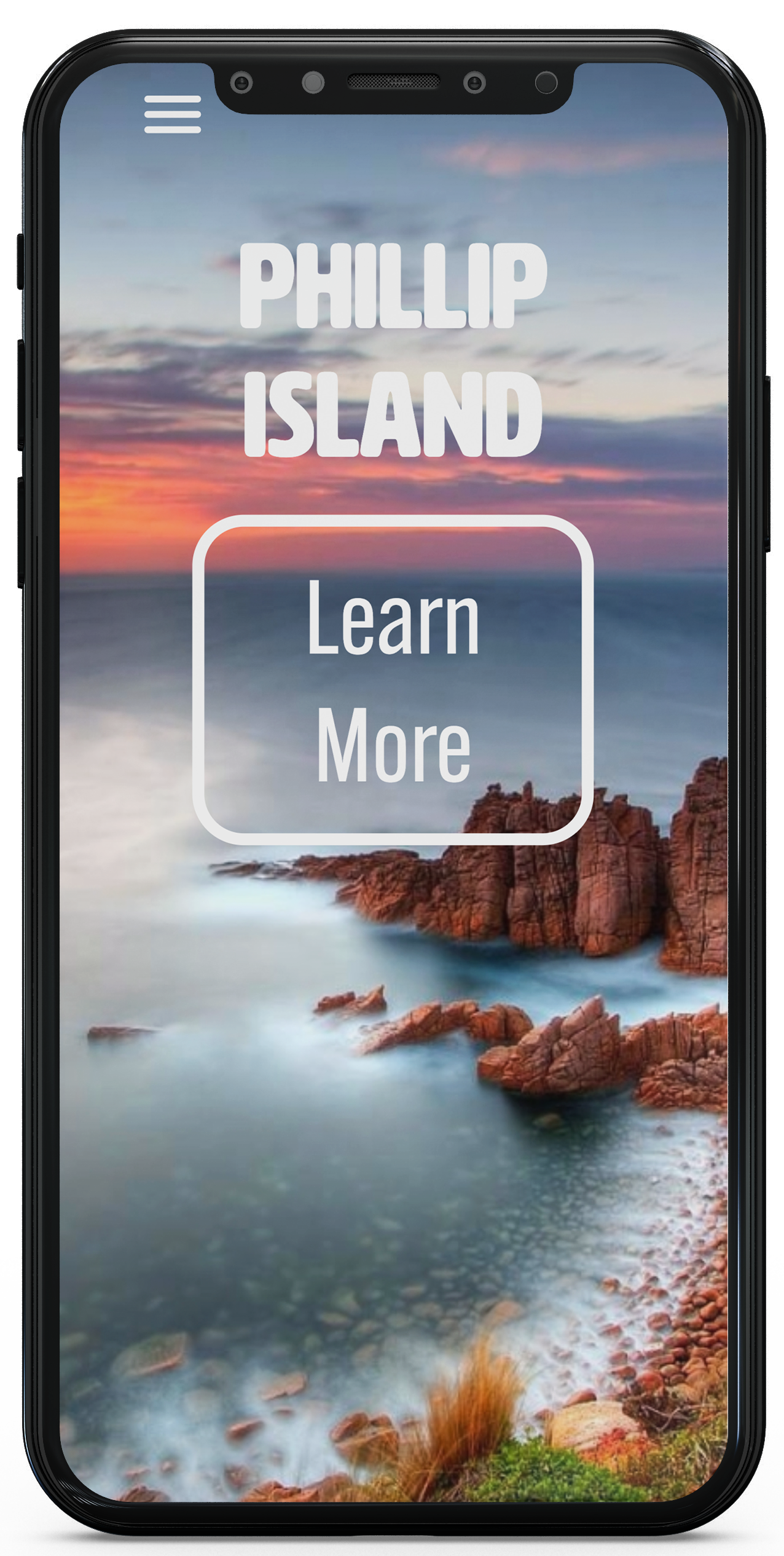
I then began prototyping the site in Figma. It was important to consider how the site actually looks on a phone, and not just assuming. For example, the navigation bar does not fit on mobile the way it does on a desktop. The same applied to the hero image on the homepage. I found an image that looked better vertically, for smaller screen sizes. The prototype is clickable, and shows all of the features of the site.

Development
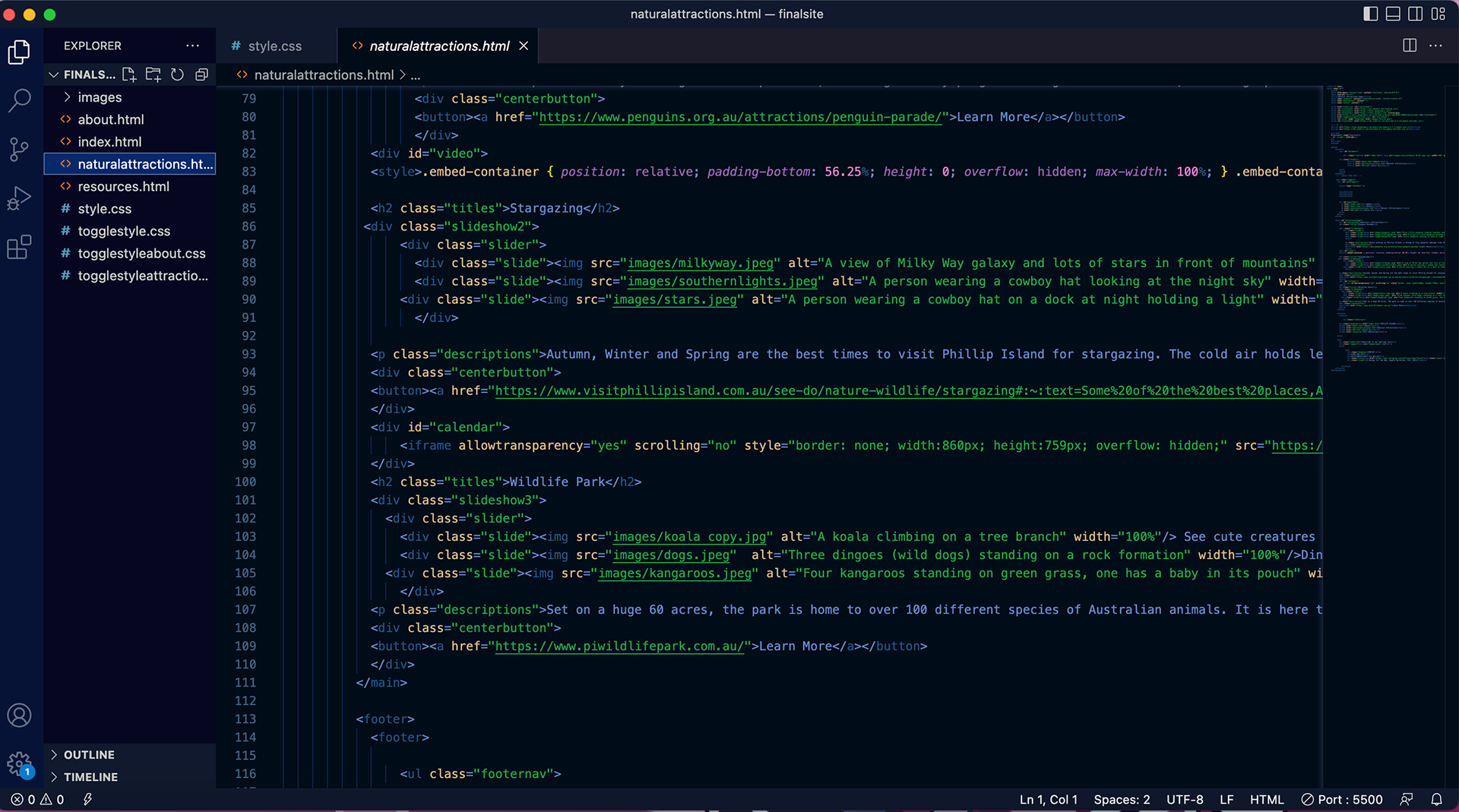
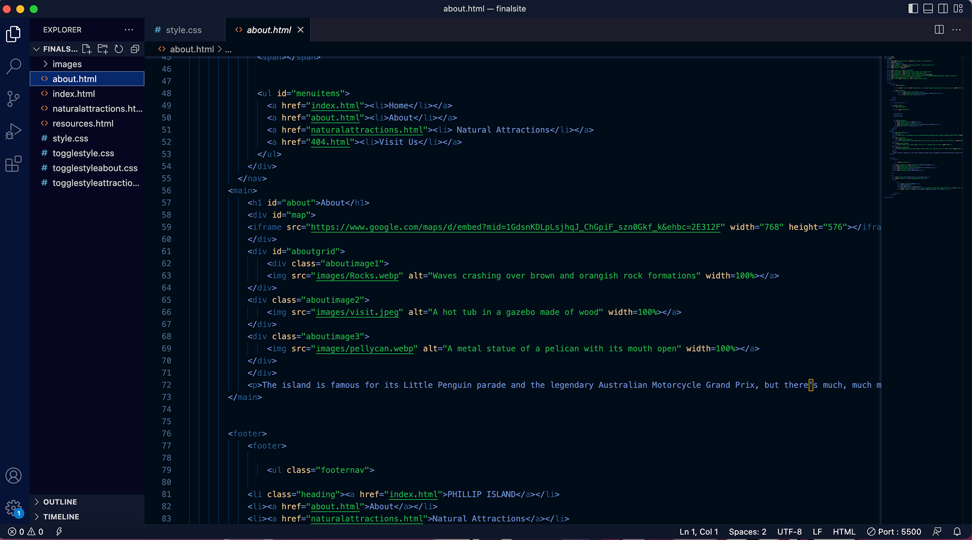
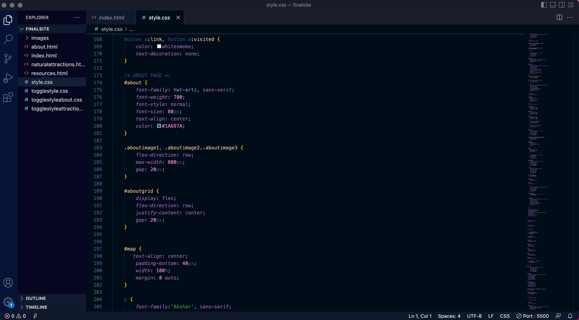
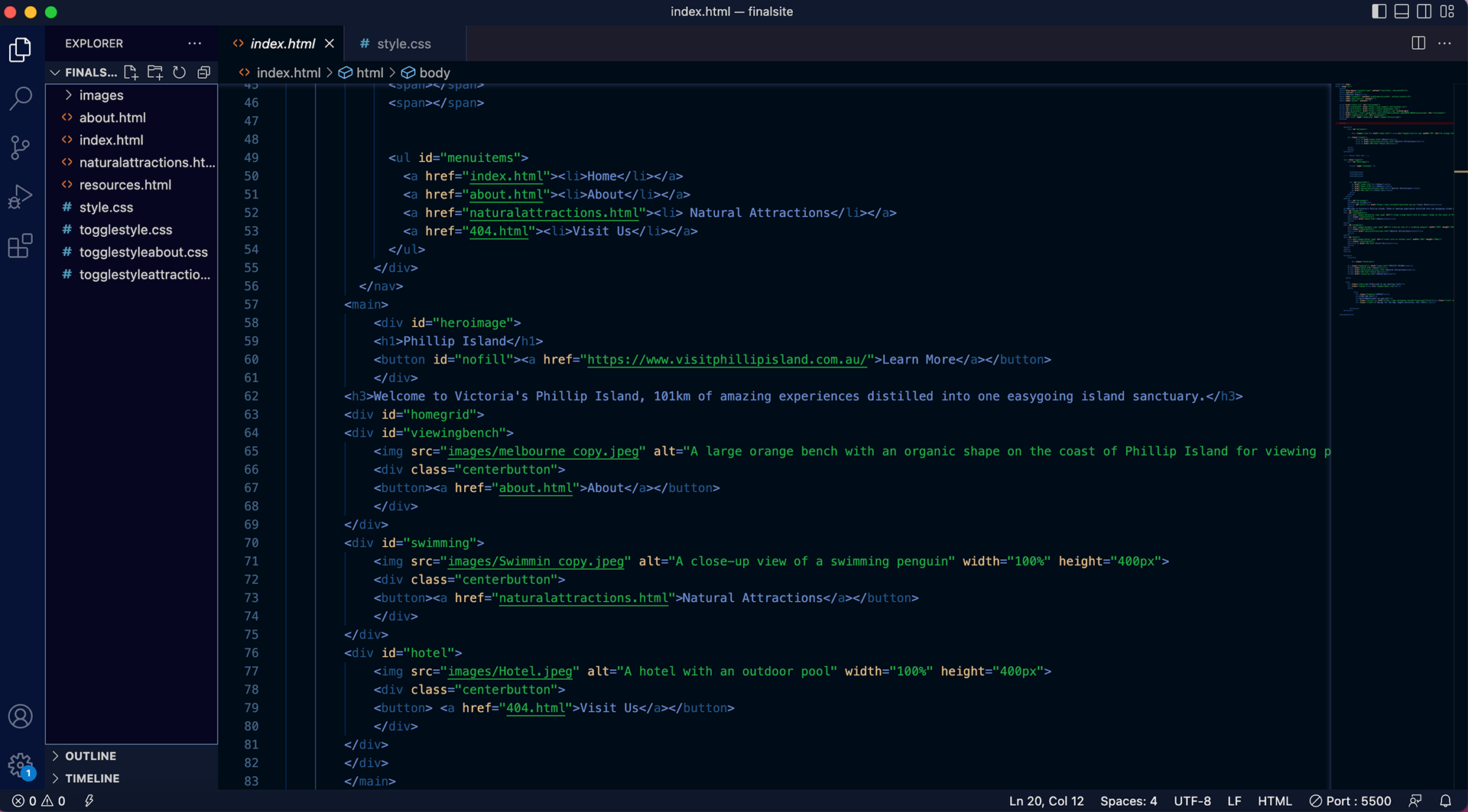
This was my first time coding with HTML, and it was extremely overwhelming at first. I worked on each page at a time, first inputting the information, then stylizing the page with CSS. I was able to make the final site look very close to my prototype, although some minor changes needed to be made. Most notably was the footer. It was very difficult to organize and keep all of the information together, so its design in the final site is more simple than in the prototype.
Branding
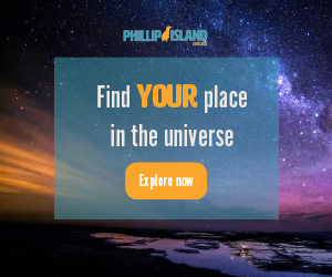
To bring attention to Phillip Island, I created these web advertisements and a promotional email. They show the general visual language of the travel site, and highlight the features that users can learn about by visiting the site. The mini style guide encompasses the visual language of the site, and shows how the logo should be used.
